
Saturday, 9 April 2011


Friday, 8 April 2011
Thursday, 7 April 2011


Saturday, 2 April 2011
Production Log 7
Today I have started on my evaluation. I plan to finish this in a week. In my evaluation I have to answer a number of questions, and those are :
1. In what ways does your media product use, develop or challenge forms and conventions of real media products?
2. How does your media product represent particular social groups?
3. What kind of media institution might distribute your media product and why?
4. Who would be the audience for your media product?
5. How did you attract/address your audience?
6. What have you learnt about technologies from the process of constructing this product?
7. Looking back at your preliminary task, what do you feel you have learnt in the progression from it to the full product?
Friday, 1 April 2011
Production Log 7
Today I have finished designing my double page spread. I plan to start my evaluation tomorrow.
Monday, 28 March 2011
Production Log 6
Today I have finished taking pictures that I will use for my double page spread, and edit them using Photoshop CS4. I plan to finish double page spread by this week.
Friday, 25 March 2011
Production Log 5
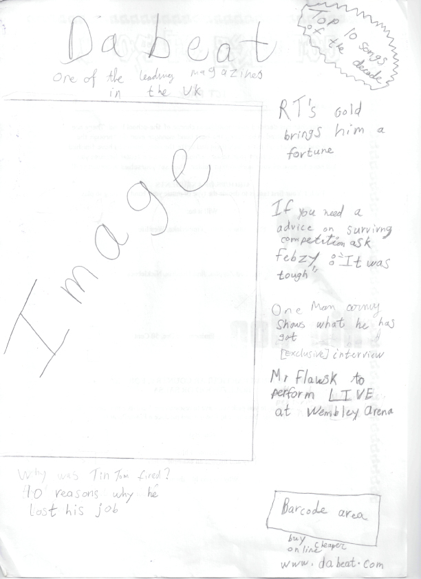
Today I have finished the final draft of my double page spread, and I plan to paste this final draft onto a document in Photoshop CS4 where I will create the actual double page spread for my magazine.
Wednesday, 23 March 2011
Production Log 4
Today I have finished my first draft of double page spread article, and I am planning to finish the final draft in two days time.
Tuesday, 22 March 2011
Production Log 3
Today I have started to write the first draft of my double spread page I aim to finish the first draft by tomorrow.
Sunday, 20 March 2011
Production Log 2
Today I'm about finish my contents page, and intend to design my double page spread tomorrow. Yesterday I was half way through designing the contents page I finished designing the front cover.
Thursday, 17 March 2011
Production Log 1
I have spent over a week designing my front cover, and today is the day I will give it a few finishing touches. I also plan to start my contents page today right after I have finished designing my front cover.
Tuesday, 1 March 2011

Tuesday, 15 February 2011
Sunday, 6 February 2011
Double Page Spread analysis (2)

This is a double page spread from the magazine named “Mixmag” it specialises in British dance music.
This page has been well organised into different sections, moreover the use of subheadings will guide the reader to their wanted section. The images used can be related to the readers who enjoy partying and from these images they can get a rough idea of what they look like when they are in a party dancing.
The headline which says “The Big 3” tells the reader what the rest of the article is about and the same colour scheme is used in the article which means that the colour scheme has been consistent. The number 3 is in pink font colour as there are 3 sections on the article and each of them numbered in order, also the numbers of the section are in pink font colour. This double page spread is closely related to the target audience who are interested in partying and dancing (also known as Party animals) because that is what the images on the page convey the theme of partying.
Double Page Spread analysis (1)

The main headline is a quote from the article which suggests that it is related to the article. Lilly Allen’s name is in red font colour, this is done so that it can deviate from the neighbouring text. The background colour used is white; the reason behind it is so that the reader’s attention is focused on the image and the article. The colour scheme has remained consistent which helps the magazine being distinguished from other magazines that will be near it on its shelf life.
The image of the artist (Lilly Allen) takes up all the space on the right hand side page and the left hand side page is all used for the article. At the very beginning of the article they have made the first letter in bigger size font than the rest of the text. The text is organised by columns which makes it easy for the reader to follow the text and digest the information.
In the image Lilly Allen has an eye contact with the audience, which means that the audience are directly being addressed, this will grab their attention. She has a firm eye contact with the reader which portrays that she is fierce and requires importance. The mise-en-scene use relates to the colour scheme because the costume that the artist is wearing has similar colours to the colours used in the article. The costume used also suggests that she more manly than womanly because what she is wearing is usually worn by men, this also means that she is subverting the stereotypical representation of the female gender.
Contents page analysis (2)

This contents page is from Drummer magazine we can see that because the name of the magazine gathers attention through the use of a big font size. The contents on this page are smooth and easy to read, which means that the readers won’t have to hassle to read it, and the audience can just skim through the page and decide if they should buy the magazine or not. They have used 3 colours black, white, and orange moreover the colour scheme is remained consistent throughout the page which avoids the reader getting confused. The way the images have been placed on the page shows that this page is highly organised, and is very communicative. They have split the contents into sections this done so that the readers can find exactly what they are looking for, for instance if the reader wants to read something new and interesting they can browse the contents in the “Features” section, or if they want to read something that usually comes up then they browse through the “Regulars” section. This makes it convenient for their audience. The big image of Dave Lombardo is in the central of the page shows its importance through its size and position, the size will gather attention because it is bigger than any other image on the page, and the position will gather attention because it is in the centre so it requires the central attention. In addition says “Exclusive” next to content heading which indicates that the article about Dave Lombardo is the leading article in the magazine.
Contents page analysis (1)

The main intention behind the use of a contents page is to show the reader what will come up inside the magazine, and on what page to look for it. The contents page needs to be easy and simple to understand. The use of the colours black, white, yellow, and red remains consistent throughout the whole page. The contents follow one after another so that it is easy for the reader to find what they are looking for; there are some contents on the right hand side of the page these contents have images and use different colours than the contents on the left hand side of the page, this is because these contents require special are more appealing to the readers and therefore the use of extraordinary features make them stand out from the rest of the contents. The use of a white background is very efficient so that the reader can concentrate on the text and not get distracted by anything else. The contents on the left hand side are emphasised in bold text which lets the reader know about what the article is about, and minor detail is used in a fancy font style which subverts to the conventional content pages as they commonly use a font style that is easy and simple to read. The layout also subverts the conventional layout of contents pages which usually have a straight page whereas this page has a layout that is a slightly rotated at an angle. The target audience for this magazine is people who like to listen to Rock music as this magazine specializes in Rock genre.
Textual Analysis (3)

The magazine ‘Blender’ doesn’t really specialize in a specific genre it gives information about music in general, and the current issues in the music industry. From the front cover we can see that their target audience is female this is because they have used pink colour for some of the fonts, the colour pink is stereotypically appealing to the female gender. They have also used black has their font colour along with pink, this is because they want to add the stylish effect so that the magazine would bear no resemblance to other magazines around it on the shelf. Another reason why they have used these colours is so that the sell lines can stand apart from the background.
The sell lines show that the magazine doesn’t specialise in any particular genre because they have mentioned Katy Perry’s name on the top left, and on the bottom left it says “Keeping it wheel RAP’s Greatest rides” this indicates that the magazine is aiming at a mainstream audience because Katy Perry does her music work in the Pop genre whereas rap itself is a complete different genre than Pop. The font style they have used is something different than the common font styles such as Times New Roman, Arial and Verdana, this is because most magazine (editors) use these font styles and in this magazine they have decided to utilize something different so that this magazine can standout from the other magazine on the shelf, and if it stands out then there is a chance that it will be sold.
They have used an image of the artist Katy Perry, and from the image we can see that she is making an eye contact with the audience, therefore the audience is being directly addressed, the reason that they have used this mode of address is because the audience will engage with the magazine if the artist is making an eye contact with them. The main image is used to attract people who like Pop music and/or are fans of Katy Perry, moreover it suggests that the magazine is also attracting the male gender as their audience this is because Katy Perry (a female artist) is revealing most of her body due to the costume, she is wearing, in addition they have used some make up on her to enhance her looks they have used this type of mise-en-scene to captivate the male audience. However the female gender in the audience would see her as a role model, so they would imitate her way of dressing up, her way of posing and if they know a lot about the artist they would also replicate their lifestyle with artist’s lifestyle.
Katy Perry is being addressed as a “Pop’s Bi-curious babe” as it says on one of the sell lines the phrase curious means eagerness to learn, so this sell line highlights that Katy Perry is eager about the Pop genre. On the top right it says “186 more must have songs” they have emphasised the words “must have” with making the text in bold, they have done this so that the audience knows that those 186 songs are commonly popular amongst the people in England and/or America
On this magazine front cover it has a special offer for its readers; at the very top it says “Free downloads! 10 Hot New tracks” this again is used to attract the audience as majority of the people in the audience would find it pleasing to get music for free.
Monday, 31 January 2011
Textual Analysis (2)

Vibe is music magazine which specialises in Hip Hop, and R&B. It is now issued every quaterly with double cover. At the bottom left hand corner they placed the website address of the magazine, due to the online digital age as majority of people prefer an online version of the magazine, this signifies synergy as one of the aspects of the company, as it promotes itself across the internet which is a form of media. Looking at this front cover we can see that the target audience is of male gender because there is a picture of a female artist who is revealng her body, they use this technque in order to attract gender, in this case they are attracting the male gender. Her clothing is a costume during the photograph being taken, the costume falls under mise-en-scene. So through mise-en-scene she is represented as a stereotypical female who decorates herself, and reveals some of her body to attract men. The main sell lines such as 'Don't you wish your girlfriend was hot like me?' is emphasised by using a bigger font size to catch the eyes of their target audience.
The words 'Hot like me?' 'Vibe', 'Ciara' are used in yellow font colour. 'Ciara' is the name of the artist as the main image, her name is emphasised as she is the leading story of the magazine. 'Vibe' is in yellow so that it is emphasised to the target audience, because it is the name of the magazine, therefore emphasising the name of the magazine is important as the audience can recognise it quickly. If we put read the words in yellow font colour, the text flows like this; "Ciara hot like me?" In this context we can say that Ciara is addressing herself as hot which means aesthetically appealing, and asking a question 'like me?' she is asking if she is appealing to the audience. The question could also have double meaing because the phrases 'like me' could also mean that she is asking the audience if they like her work (music). They have used a language device here which is known as rhetorical question because it doesn't require an answer The audience is being directly addressed, we can say this because Ciara is has a direct eye contact with the audience, which catches the eyes of the target audience. The mode of address they have used is direct address.
The main image is a female artist known as Ciara. The photographer has used wide shot, so that th audience can see what she is wearing. She is wearing tight fitted clothing, and she is also revealing some parts of her body. In terms of setting we can see that there is wind being blown at her and some of hair is being blown. This image connotes that she is a attention seeker, as the male audience would gaze at her because she is visually appealing. The background colour is blue, blue is a masculine colour, they have used this colour to target the male gender of the audience. They have done this so that the audience doesn't get confused moreover the colours blue, yellow, and red don't clash which each other instead they endorse each other.
Friday, 28 January 2011


Wednesday, 19 January 2011
Textual Analysis

XXL is music magazine which was founded in 1997 and it is aimed at people who have boom town lifestyle. It specialises into R&B and Hip Hop music. On the front cover we can see sell lines such as "an exclusive interview with Dr. Dre" this is mainly used to attract his fans, as they are curious about him.
On this cover it also says "The master of the board finally returns to the game" . Visually the chess board represents the music industry and Dr. Dre is referred as the master because he is very skillful and talented with his job. When it is mentioned “returns to the game” it suggest that he has done something new in the music industry and has more where it came from. The writing in white is contrasting with his black jacket, it represents the chess board which suggest that he is into his game. Chess is a game that requires thinking and focus, and from Dr.Dre’s facial expression we can see that he is very serious about his game back into the music industry. From the image we can see that he is making his first move in the music industry.
We also see additional sell lines about Nicki Minaj, Swizz Beatz, Kanye West, and other R&B artists. This technique is used to attract fans of those artists, also highlights that the magazine is mainly going to feature the R&B genre so this means that their target audience is going to be R&B fans. When we look at the colours, the cover designer has used a conventional colour scheme. On the top right corner we see a sell line about the "Eye candy of the year", the word 'Eye candy' implies to something that is appealing to the eyes, in this case the magazine has pictures of a female model, therefore the eye candy in this case is appealing to the male gender. They have used this sell line in order to attract the male gender from the audience as they find the pictures of the female model visually appealing. The phrases 'Exclusive' and 'Plus' are typical language skills used to attract the reader's attention, these phrases mainly focus on the unique selling point which is Dr. Dre.


Subscribe to:
Posts (Atom)