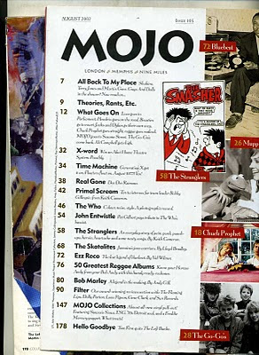
The main intention behind the use of a contents page is to show the reader what will come up inside the magazine, and on what page to look for it. The contents page needs to be easy and simple to understand. The use of the colours black, white, yellow, and red remains consistent throughout the whole page. The contents follow one after another so that it is easy for the reader to find what they are looking for; there are some contents on the right hand side of the page these contents have images and use different colours than the contents on the left hand side of the page, this is because these contents require special are more appealing to the readers and therefore the use of extraordinary features make them stand out from the rest of the contents. The use of a white background is very efficient so that the reader can concentrate on the text and not get distracted by anything else. The contents on the left hand side are emphasised in bold text which lets the reader know about what the article is about, and minor detail is used in a fancy font style which subverts to the conventional content pages as they commonly use a font style that is easy and simple to read. The layout also subverts the conventional layout of contents pages which usually have a straight page whereas this page has a layout that is a slightly rotated at an angle. The target audience for this magazine is people who like to listen to Rock music as this magazine specializes in Rock genre.
Brief: Create a front page, contents and double page spread of a new music magazine. All images and text used must be original, produced by the candidate, minimum of FOUR images per candidate.
Sunday, 6 February 2011
Contents page analysis (1)
The main intention behind the use of a contents page is to show the reader what will come up inside the magazine, and on what page to look for it. The contents page needs to be easy and simple to understand. The use of the colours black, white, yellow, and red remains consistent throughout the whole page. The contents follow one after another so that it is easy for the reader to find what they are looking for; there are some contents on the right hand side of the page these contents have images and use different colours than the contents on the left hand side of the page, this is because these contents require special are more appealing to the readers and therefore the use of extraordinary features make them stand out from the rest of the contents. The use of a white background is very efficient so that the reader can concentrate on the text and not get distracted by anything else. The contents on the left hand side are emphasised in bold text which lets the reader know about what the article is about, and minor detail is used in a fancy font style which subverts to the conventional content pages as they commonly use a font style that is easy and simple to read. The layout also subverts the conventional layout of contents pages which usually have a straight page whereas this page has a layout that is a slightly rotated at an angle. The target audience for this magazine is people who like to listen to Rock music as this magazine specializes in Rock genre.
Subscribe to:
Post Comments (Atom)

No comments:
Post a Comment